Prototype
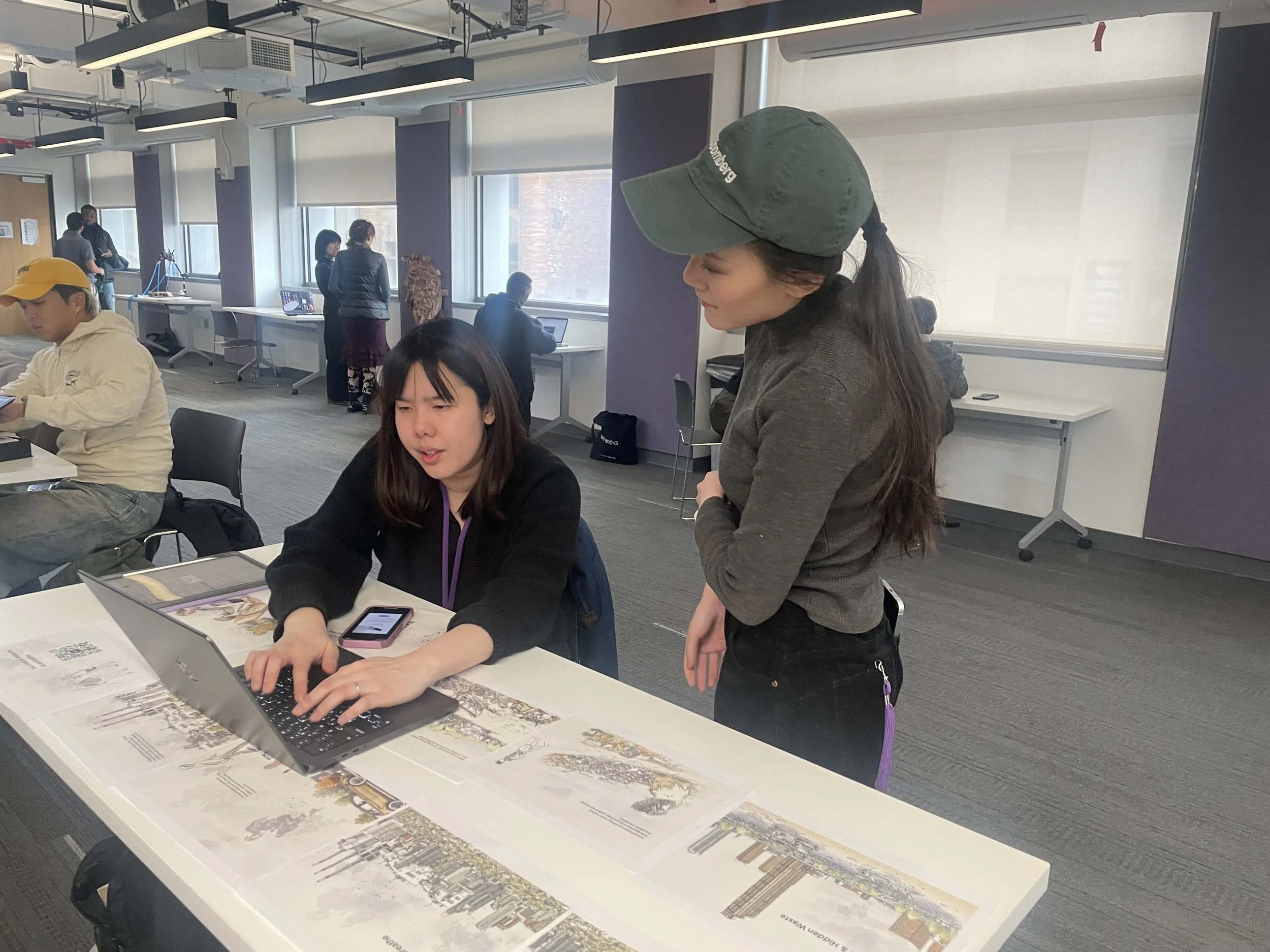
User Testing

1. Interaction Design: Alternative Choices Before AR
Users prefer to see the outcome of their actions on-screen before scanning the QR code for AR.
Suggested solution: Slider bars (before/after) → Users drag from left to right to visualize change.
Final AR experience should reinforce choices rather than be the only interactive moment.
Improvement:
- Add buttons or sliders on the website for users to select an action before scanning AR.
- Keep AR as a reflective moment, showing the impact of their choices.
2. Storytelling & Emotional Engagement
Users love the hand-drawn architectural style for storytelling.
This style makes the experience more personal compared to real images, which evoke a sense of urgency.
Real images are still important for showing macro-scale impact and inspiring real-world action.
Suggested solution:
Use illustrated characters to guide users through the journey.
At the end, transition to real images & data to emphasize the real-world consequences.
Improvement:
- Introduce a main character to lead users through the story.
- Use real images at key moments (e.g., X-ray of a lung affected by air pollution).
- Integrate data visualization (e.g., AQI comparison charts, pollution density maps).
3. Enhancing Website Interactivity
Users loved simple interactions like mouse hover and click to clear pollution or remove trash.
They wanted to feel part of the scene, interacting in small ways that create immediate impact.
Improvement:
- Morning Scene: Use mouse hover to clear the air pollution.
- Lunch Scene: Drag and drop trash from the river into recycling bins.
- Evening Scene: Click to add trees and parks, visualizing how green space improves the environment.
4. AR as a Reflective & Pacing Element
Users felt that AR should serve as a break in the experience rather than an interruption.
It helps them pause and reflect on their choices.
Improvement:
- Scrolling through the website flows naturally, with AR acting as a natural pause.
- Final AR scene should show a summary of user actions → Reinforce the impact.
- Add a “Learn More” button in the AR scene to link to real-world data and case studies.
5. Information Hierarchy & Callouts
Users want clear primary messages with secondary details available when needed.
Suggested solution: Labels on plastic waste to call out environmental details.
Improvement:
- Primary messages → Big, bold key insights.
- Secondary information → Hover effects or expandable text for deeper learning.
6. Visual & UI Design Preferences
Users loved the drawing style for its personable and inviting feel.
They preferred 2D layers with camera panning over excessive 3D.
Consistent visual language between sketches and real images helps maintain coherence.
Improvement:
- Use consistent illustration style throughout the journey.
- Limit 3D models to enhancements, not distractions.
- Apply camera-based panning for storytelling.
7. Real-World Data & Urgency
Users want numbers to make the issues feel more real.
Suggested solution: AQI meters, air pollution density maps, case studies of real people affected.
Improvement:
- Add a vertical AQI bar comparing air quality in different locations.
- Introduce data points in key areas (e.g., pollution levels in different parts of Bangkok).
- Link to case studies of people suffering from pollution-related illnesses.

Web References
Technologies
Styles: Sass preprocessor + BEM naming convention
WebGL: Three.js
3D Assets: Blender
Motion: GSAP
Scroll manager: Lenis
CMS: Wordpress
Deployment and analytics: Vercel