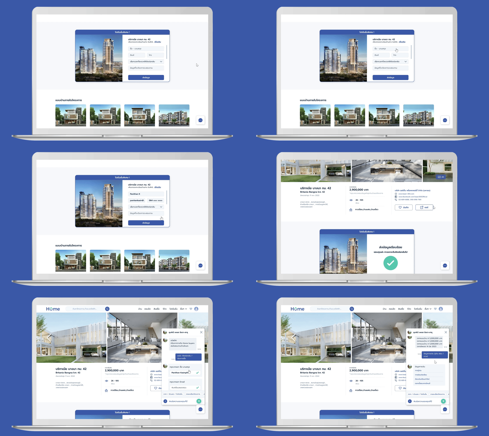
The redesigned real estate platform website showcases a user-first design, enhancing ease of use to improve engagement, extend user sessions, and elevate conversion rates for property viewings.
My role
UX/UI Design and prototypes
UX research and user interviews
Design handoffs with developers
Brand Identity
Design System
Result
50%
increased in user sessions
7.8%
reduced bounce rates
9.3%
increased session duration
26%
boosted in lead conversions
1 Project Manager , 4 Web Developers , 1 Lead Programmer, 1 Data Scientist , 1 SEO/Web Specialist
Team
Figma, Adobe Photoshop, Adobe Illustrator, Google Analytic, and Hotjar.com
Tools
Client
Home Buyers Guide Co.,Ltd.
High user drop-off rates on the previous website were due to difficult navigation and user-unfriendliness.
Problem
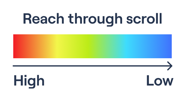
Heat map : scroll map
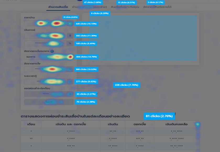
Heat map : click map
Heat map analysis from Hotjar.com shows only 40% of visitors scroll, with just 20% reaching a third of the page.
Click map analysis indicates low engagement with CTAs and unclear lead conversion points.
Search results fail to align with user needs, contributing to user drop-offs and low return rates.
Poor branding recognition is caused by inadequate visualization, a lack of visual hierarchy, and an undefined design system.
Research
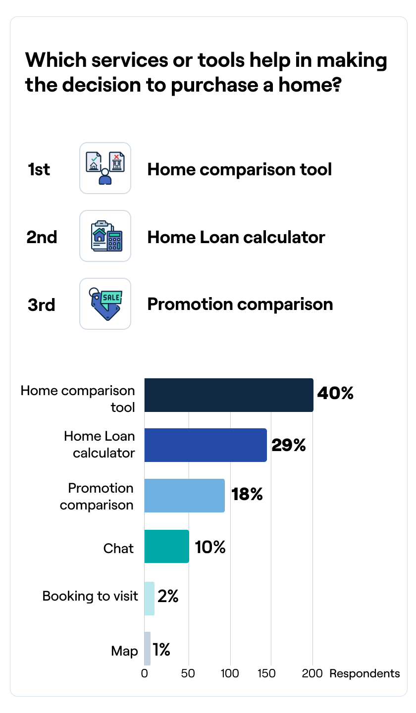
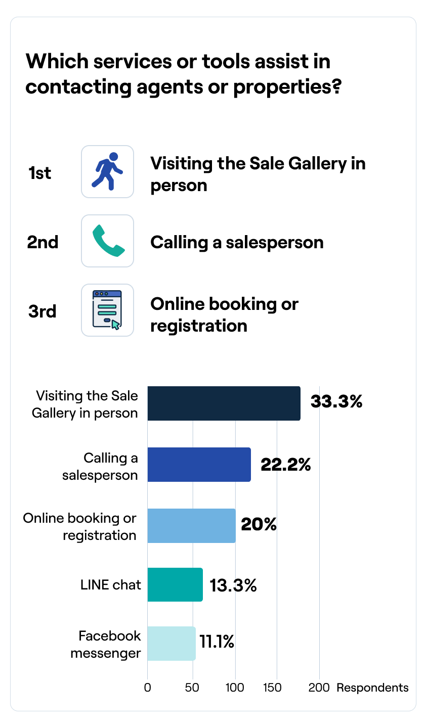
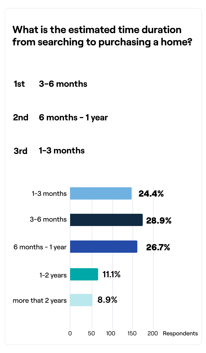
Method: Conducted an online survey with 505 respondents via Google Forms, and online interviews with 25 participants, and utilized affinity mapping, persona creation, and current journey mapping.
Research objective: Define User’s need and their pain points, identify the key factors that help make a decision to purchase home, identify the potential users
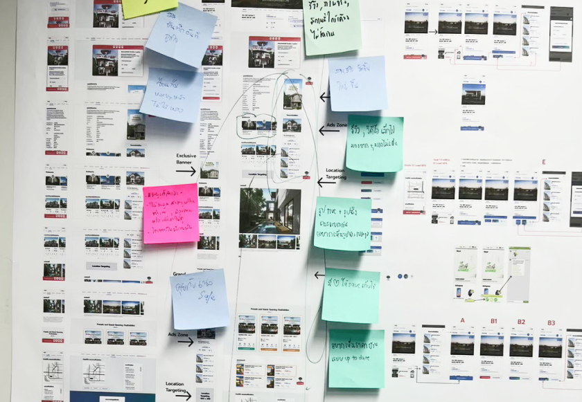
Affinity Map
I organized the notes from the survey and interviews, then categorized all the information to identify commonalities.
User Journey
I conducted interviews, turning insights into user journeys and concept solutions.
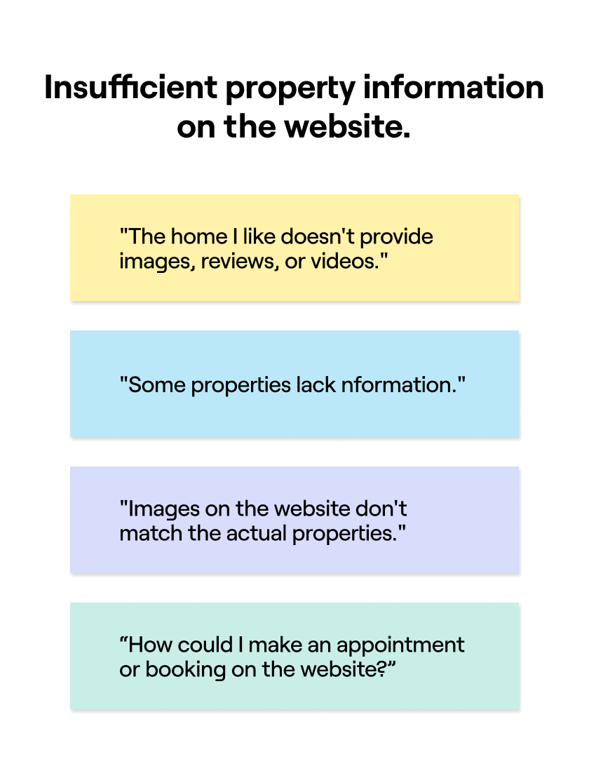
The online journey steps of home buyers consist of awareness, searching, comparison & consideration, selection lists, and planning for walk-ins, such as visiting the site gallery. However, customers often lack knowledge, information, reviews, and tools that aid in finding their ideal, affordable home. As a result, the home-buying experience can be time-consuming, effort-intensive, and may lead to mistaken decisions.
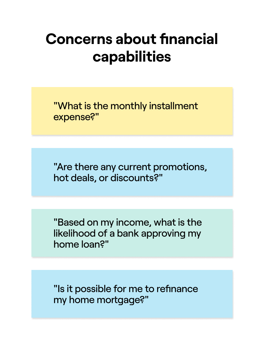
The offline journey steps for home buyers include evaluation, booking, banking, transferring, and moving in. During this journey, customers require financial information and consulting, with a particular need for promotions or special offers to facilitate decision-making.
The Challenge
How might we streamline the online home-buying experience to ensure users effortlessly find homes that meet their specific needs and preferences?
Improve the navigation and ease of use of the platform's experience.
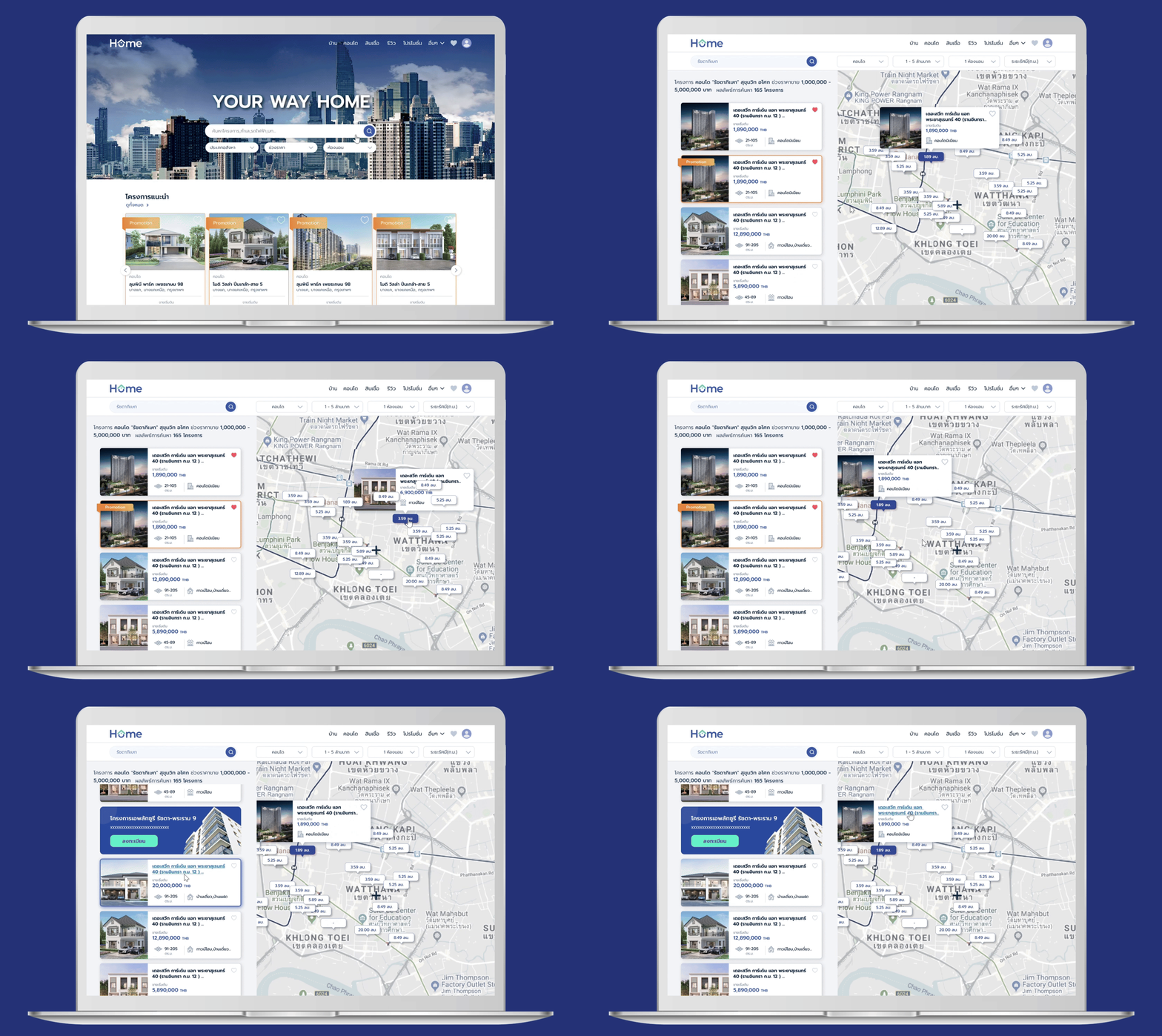
Develop a search feature for precise listing results.
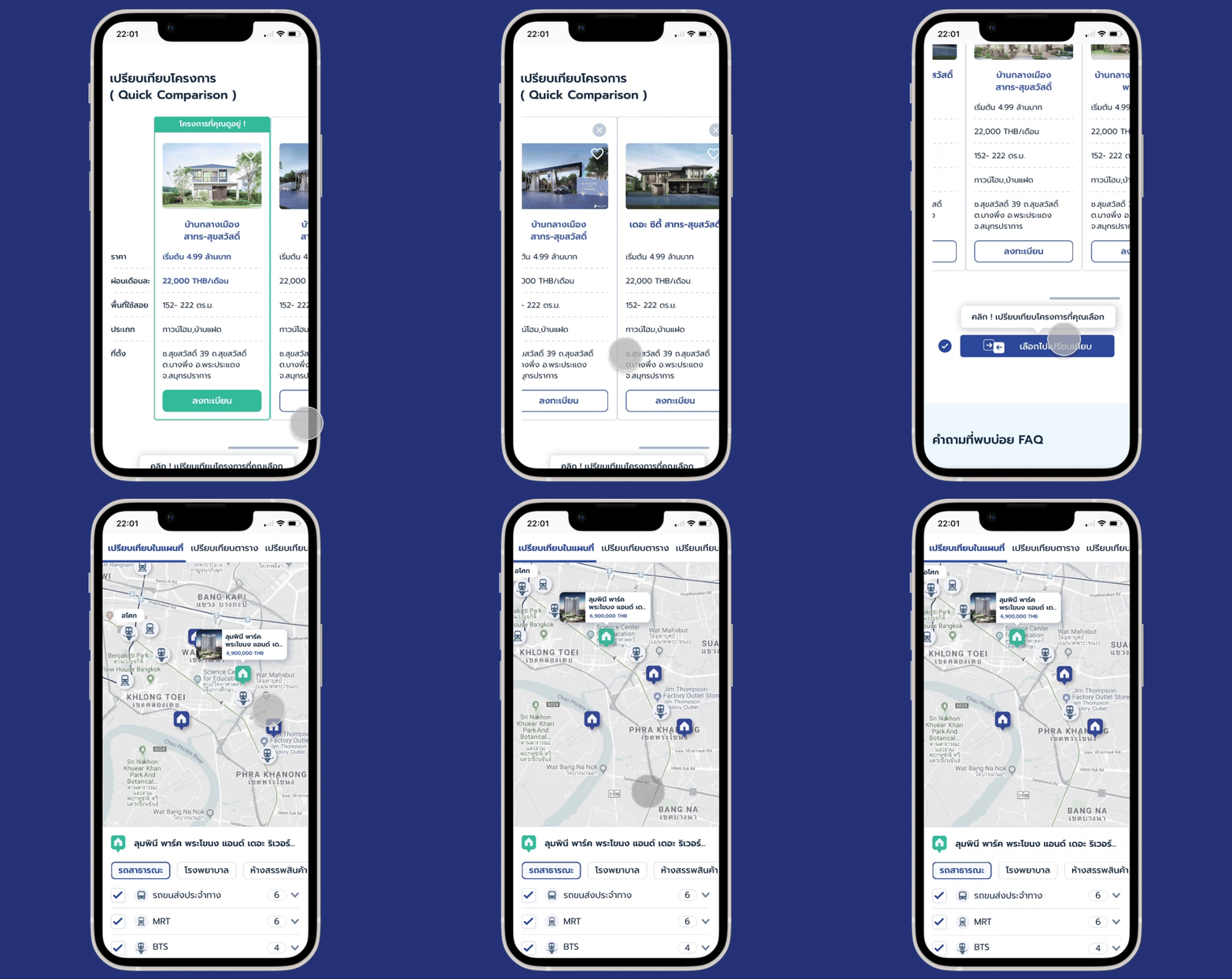
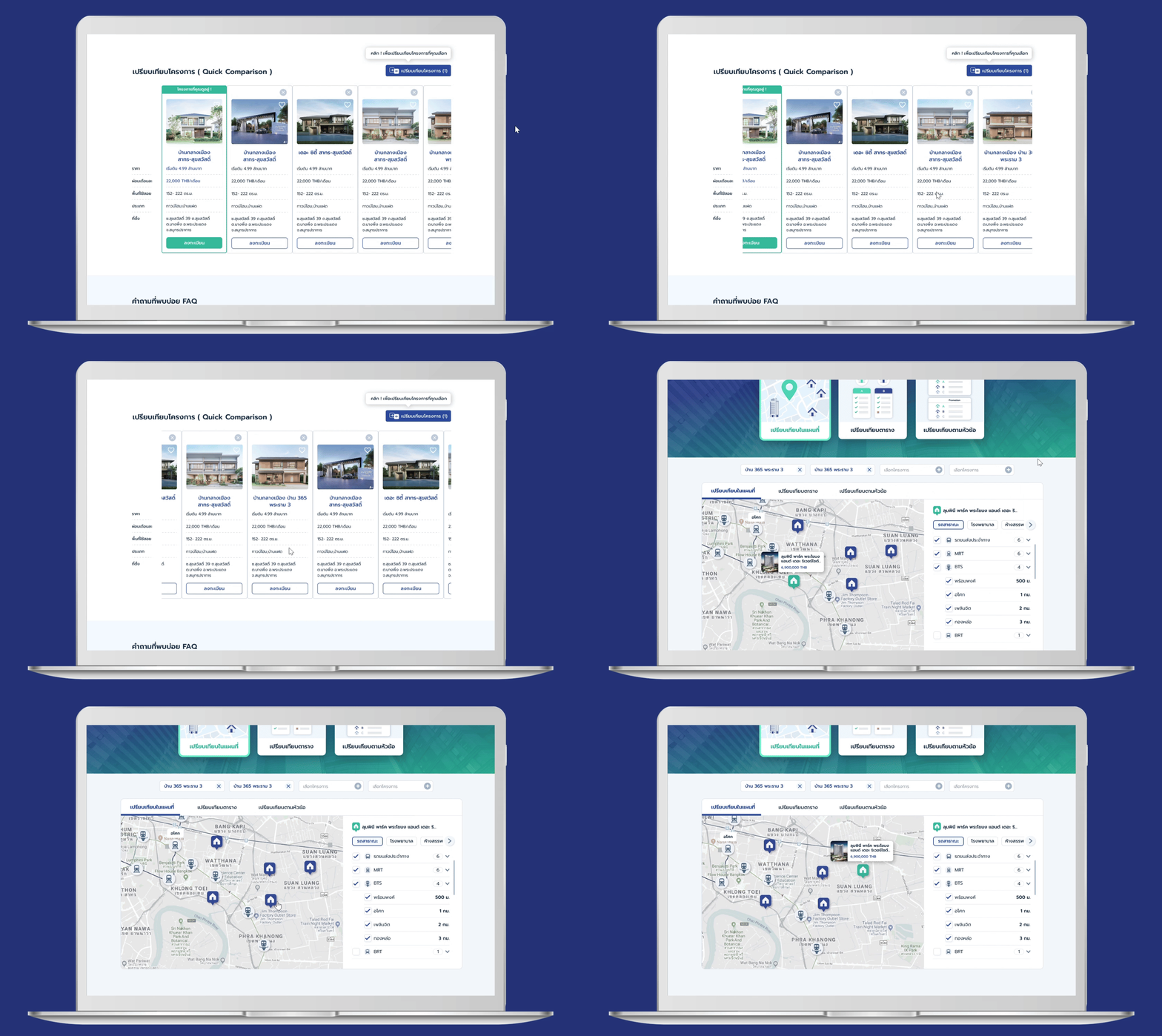
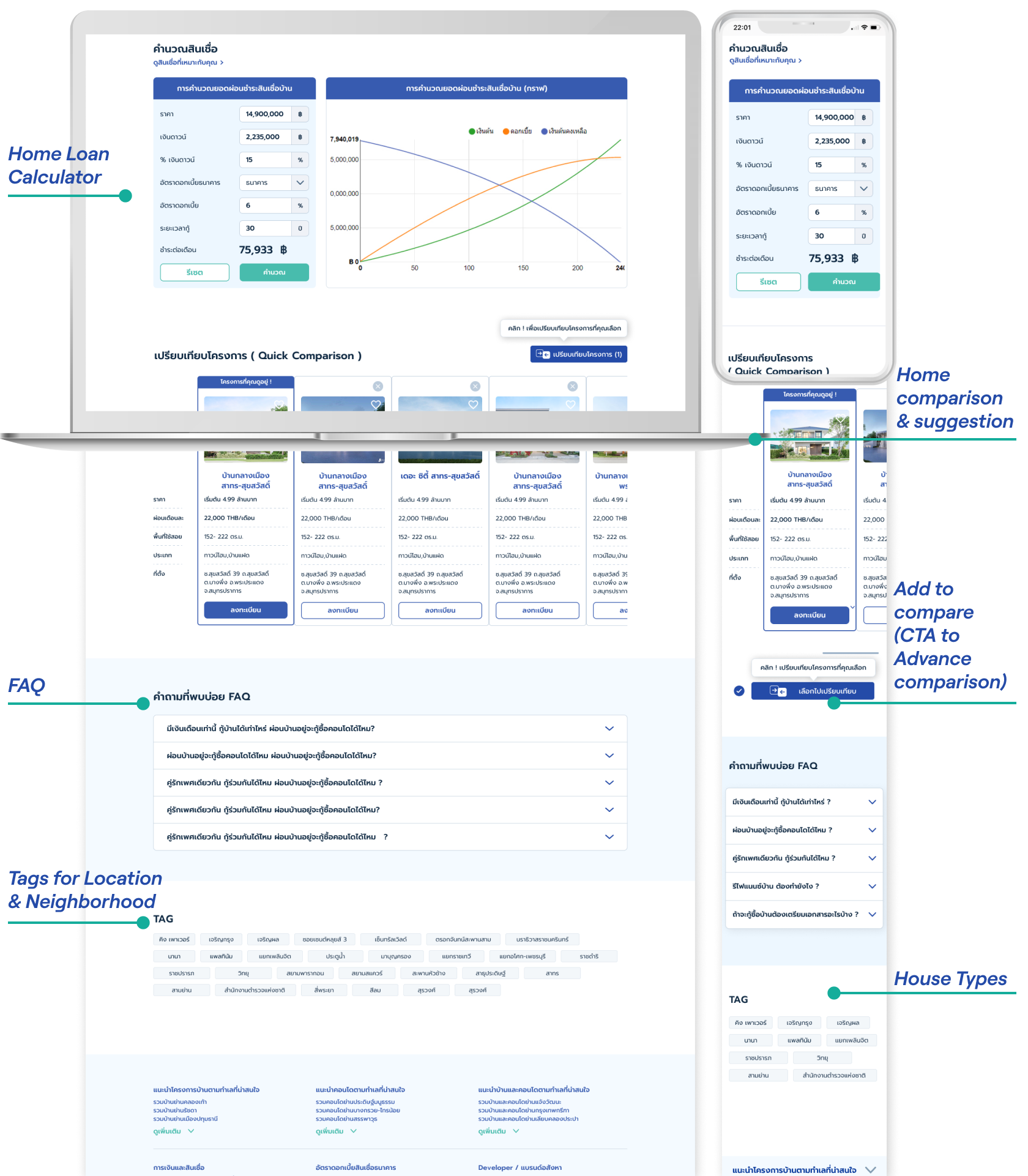
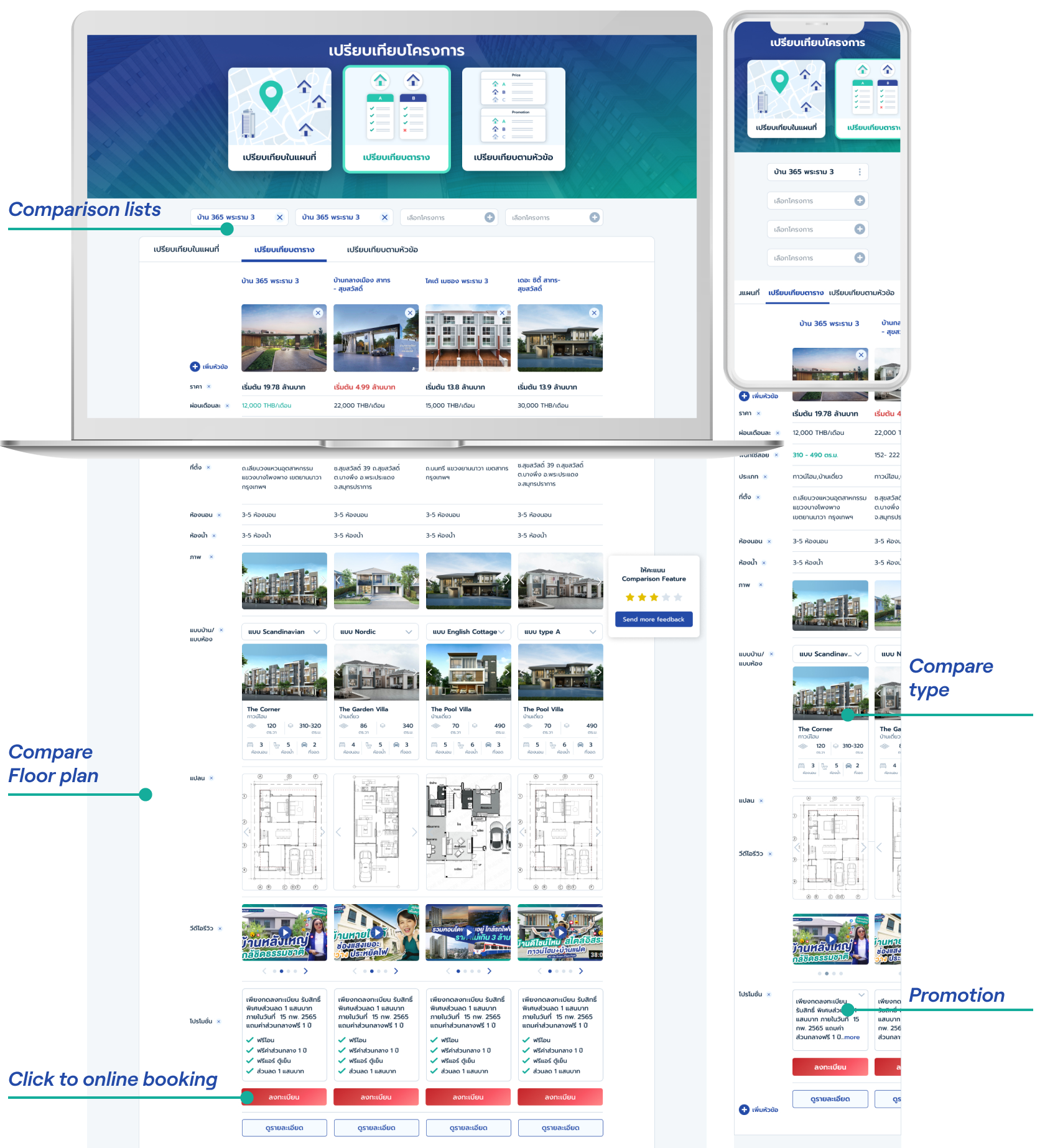
Create home comparison and suggestion features for listings.
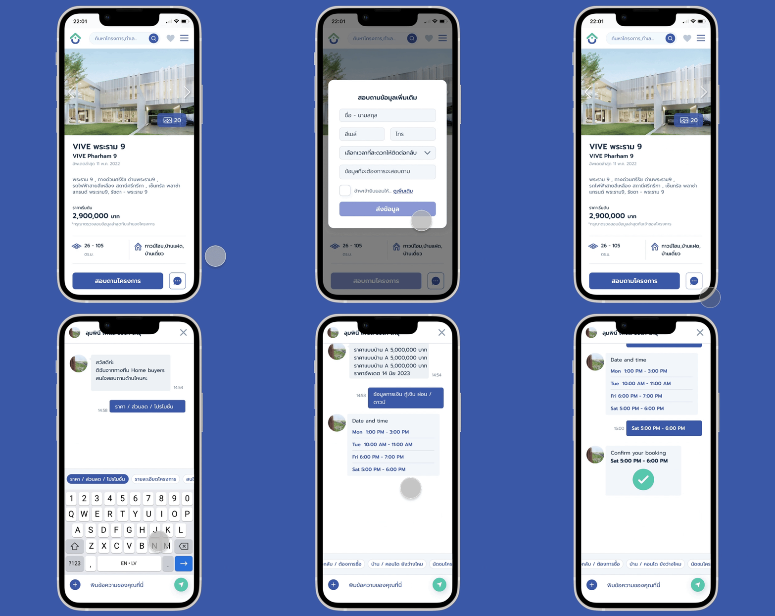
Implement online booking for property tours.
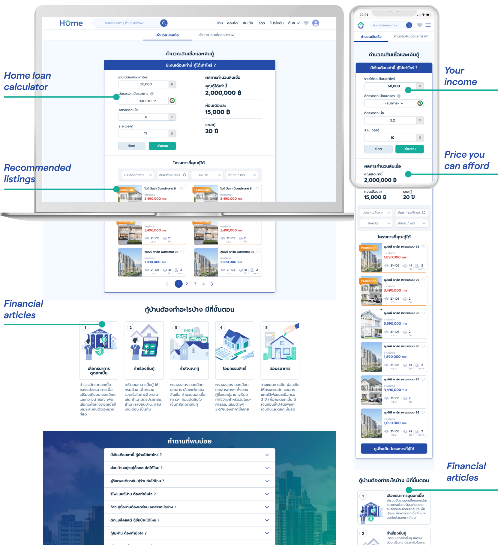
Introduce a home loan calculator to assist with financial affordability.
Personas
Site Map
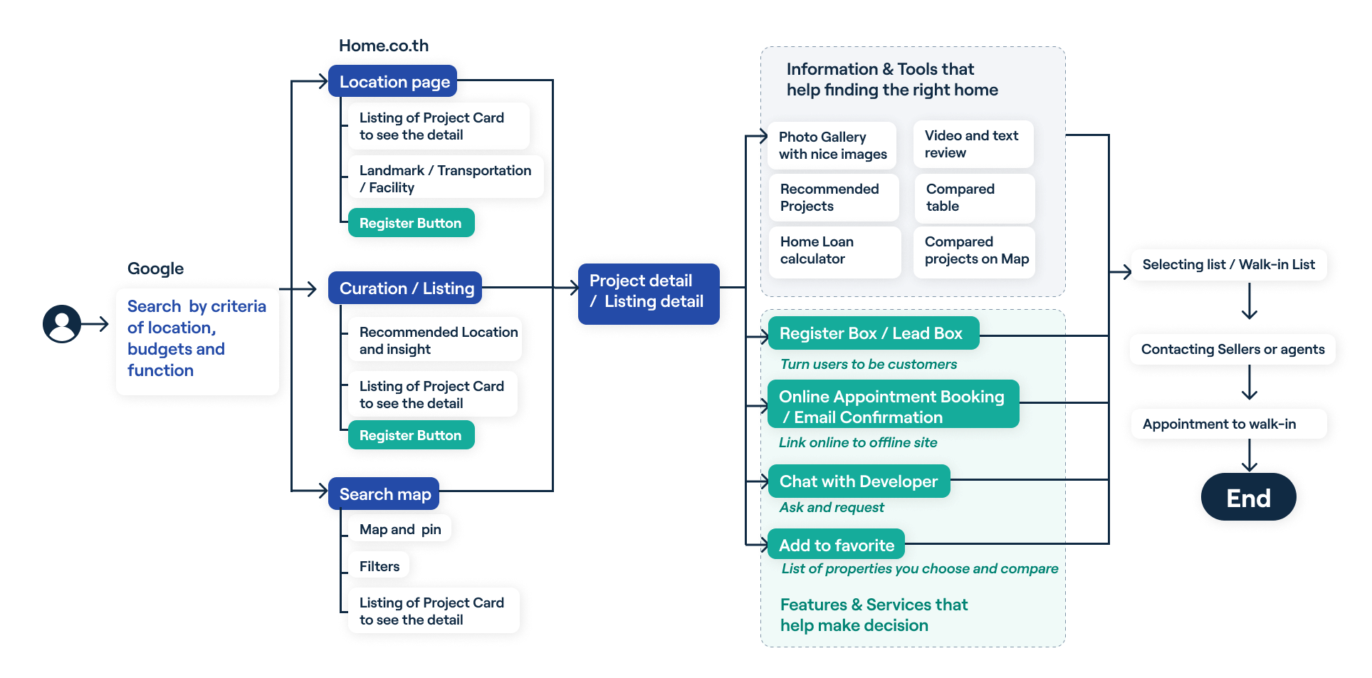
Core features: Search feature, Home comparison, Recommended projects on the map, Register/Lead Box, Chat with developer, Add to favorites, Mortgage calculation
Keeping the six core features in mind, I conducted a card sort to understand how users might expect the content to be organized. The insights gained were used to create a sitemap.
User flow diagram
User Flow
Iteration: In response to user feedback, I made revisions and sought further input from my team. I upgraded the website to a more high-fidelity design, incorporating more white space, larger icons, and clearer text. To achieve uniformity across the entire program, I integrated Gestalt principles, color theory, and grids into the design.
Search
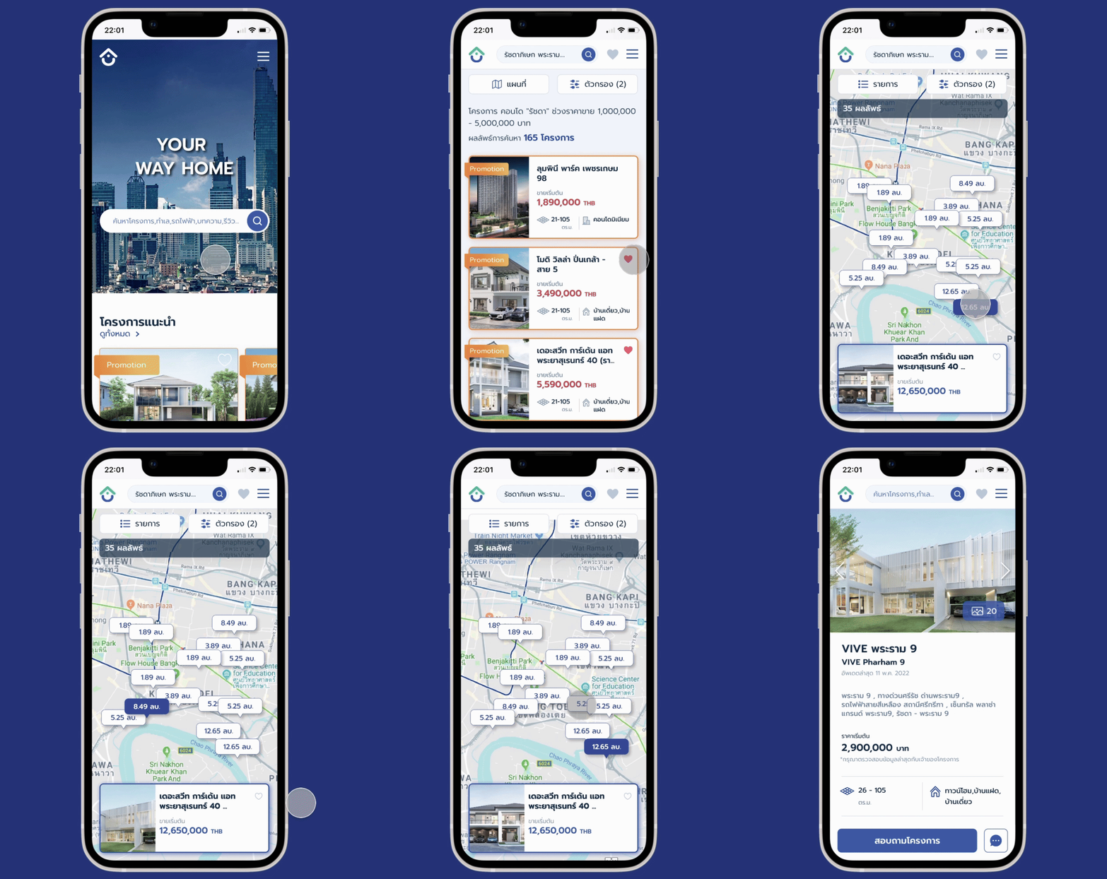
Enhanced search filters and suggested search word drop-downs reduce time and effort, yielding more efficient results for users.
Home Comparison & Suggestion
Home comparison tools aid in easy decision-making by allowing users to compare property information and suggest similar properties based on their interests.
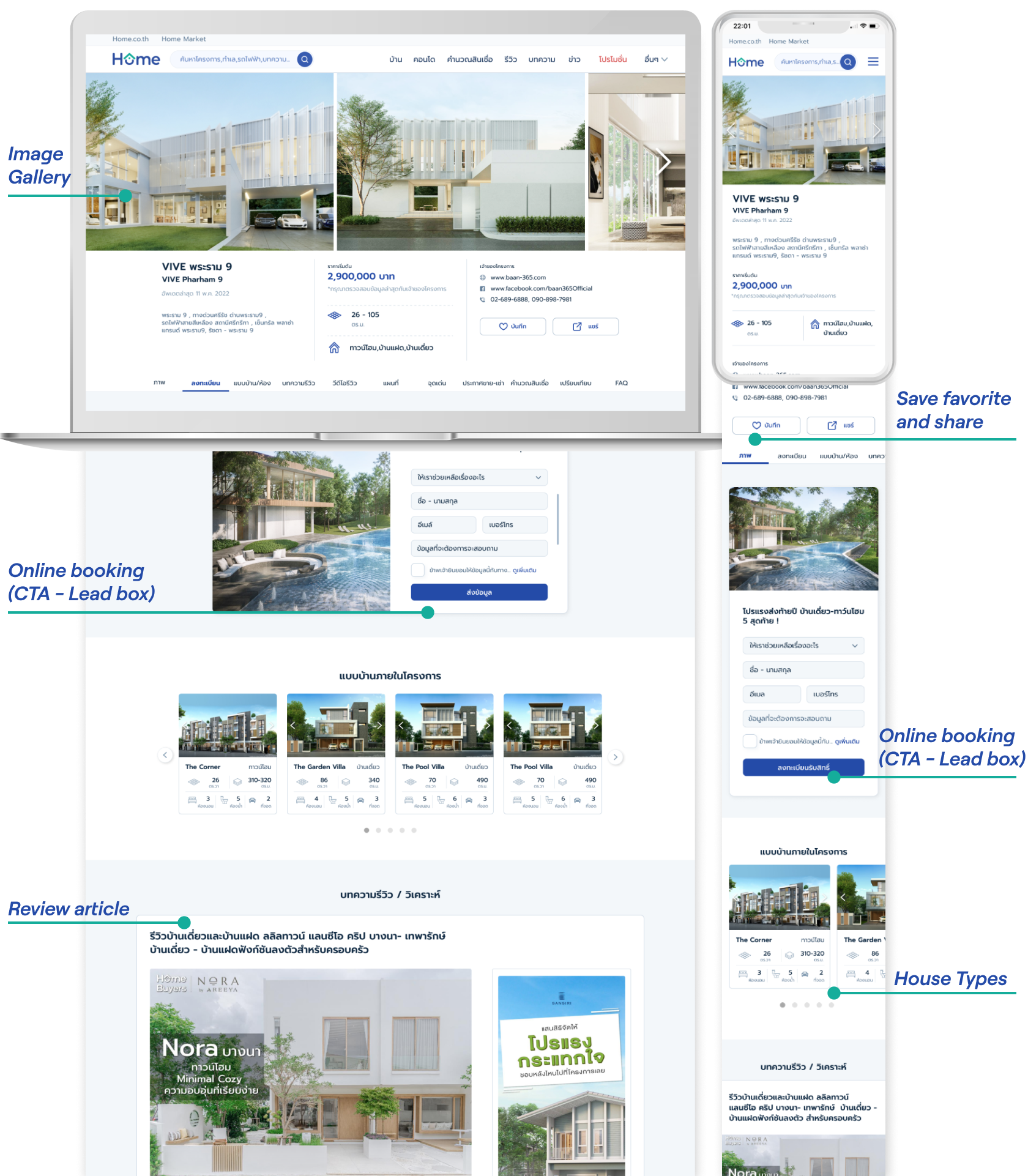
Online booking + Chat
Online booking or scheduling a tour visit acts as a call to action (CTA), effectively increasing the lead conversion rate for sales and properties by up to 50%. Users can also chat with a salesperson for more information before booking.
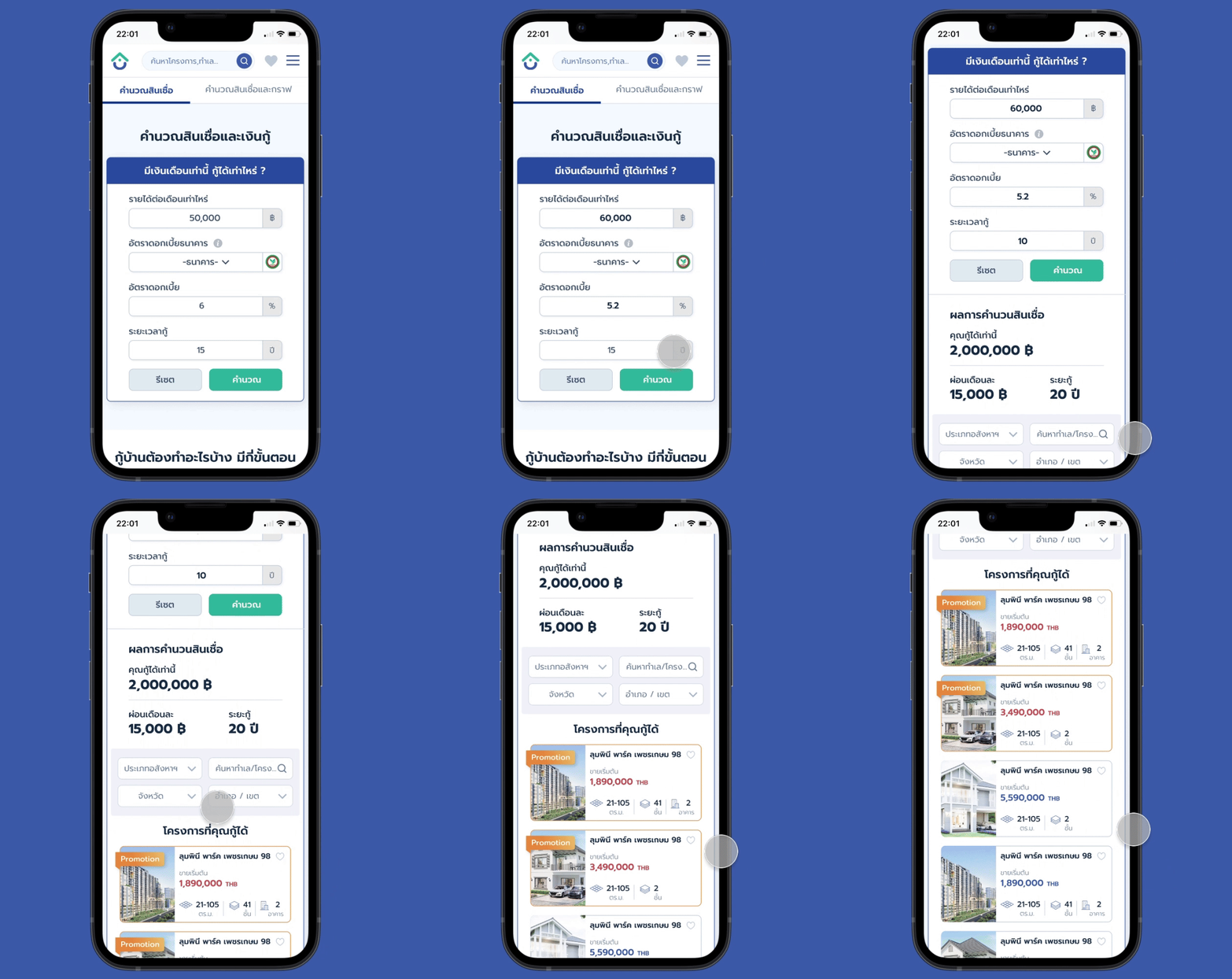
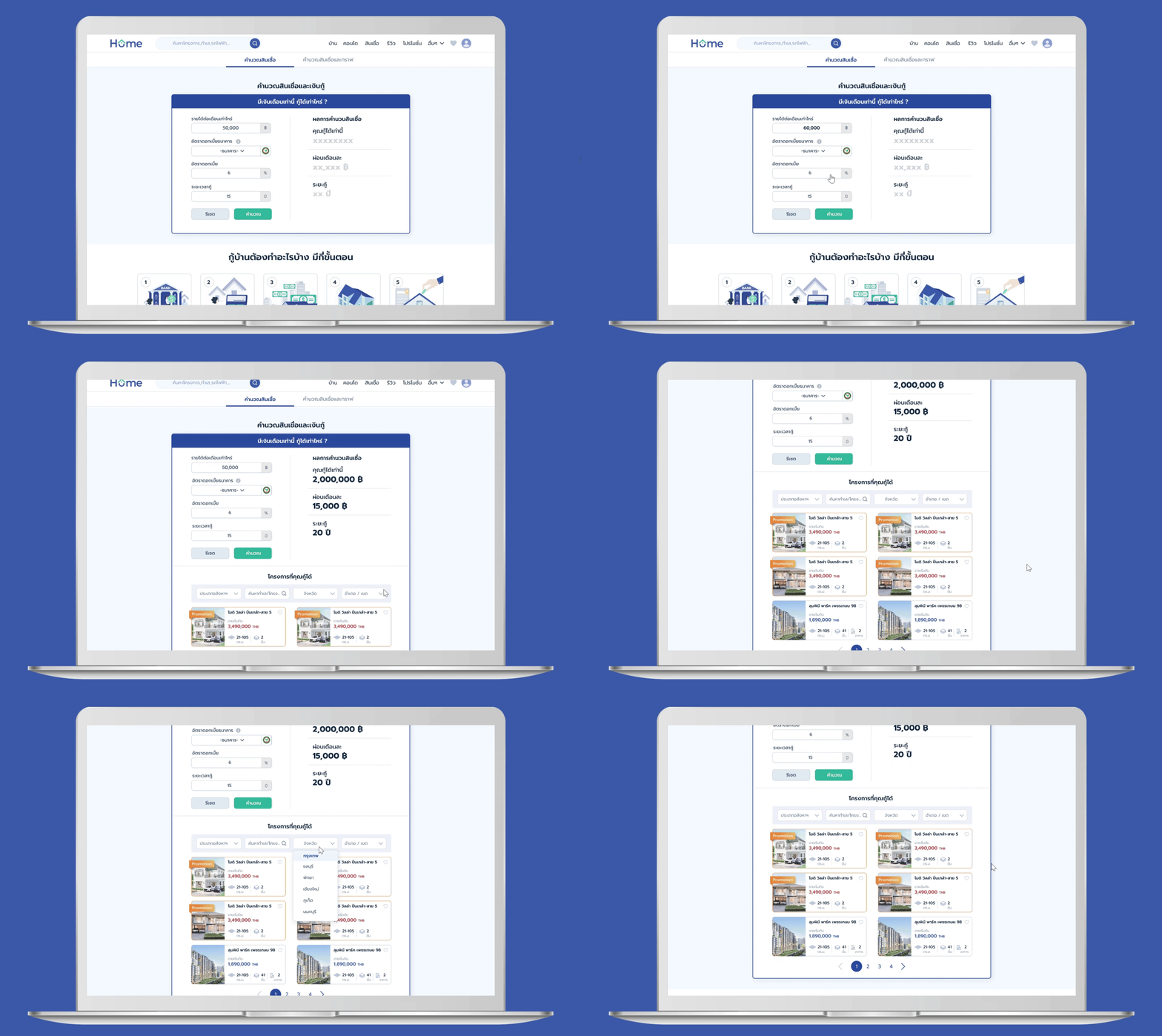
Home Loan Calculator
The Home Loan Calculator aids users in estimating their financial capacity for home purchases, suggesting affordable properties, and estimating bank pre-approval before applying for a home loan.
Brand Identity
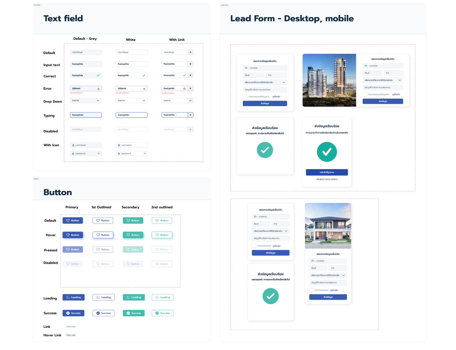
Design System
Final design
Home / Project Detail
Home / Project Detail
Search listings
Advance comparison
Home loan calculator
Search listings by train stations
Usability Testing
According to usability testing with six participants, confusion arose regarding the map search feature; initially, it displayed only home icons. Users, however, preferred seeing prices and images after clicking on these icons. Based on this feedback, we refined the website to enhance ease of use. Additionally, we employed Hotjar.com for heat map analysis to further improve the user experience.
Result Metrics
+22.4%
increasing number of users
+26.3%
increasing the number of sessions
decreasing bounce rate
-7.8%
+9.3%
increasing average session duration
Acknowledging my team
Project Manager (Pisut, Nick, and Nat), Web Developers (Sasithon, Athibet, and Tanyapong), Lead Programmer (Palawee), Data Scientist (Pipop), Marketing(Katoon)and SEO/Web Specialist (Sarawut)


