Smoonpai, a Thai herbal skincare brand, aims to increase online sales and boost brand awareness.(This is a mock-up concept)
My role
UX/UI Design and prototypes
Design handoffs with developers
Brand Identity
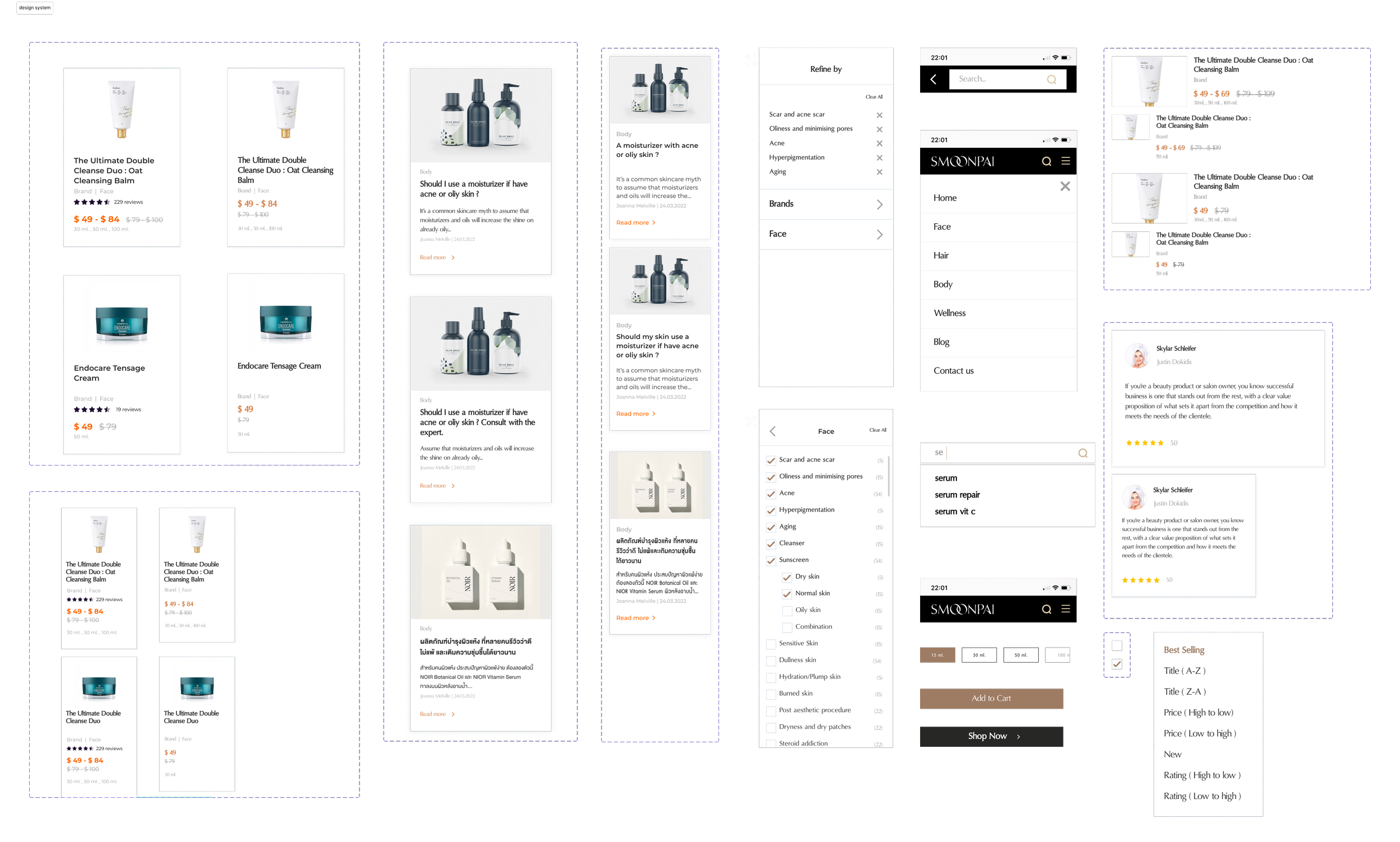
Design System
Team
Lead Marketer and Product owner
Figma, Adobe Photoshop, and Adobe Illustrator
Tools
Client
Koy Patpitcha
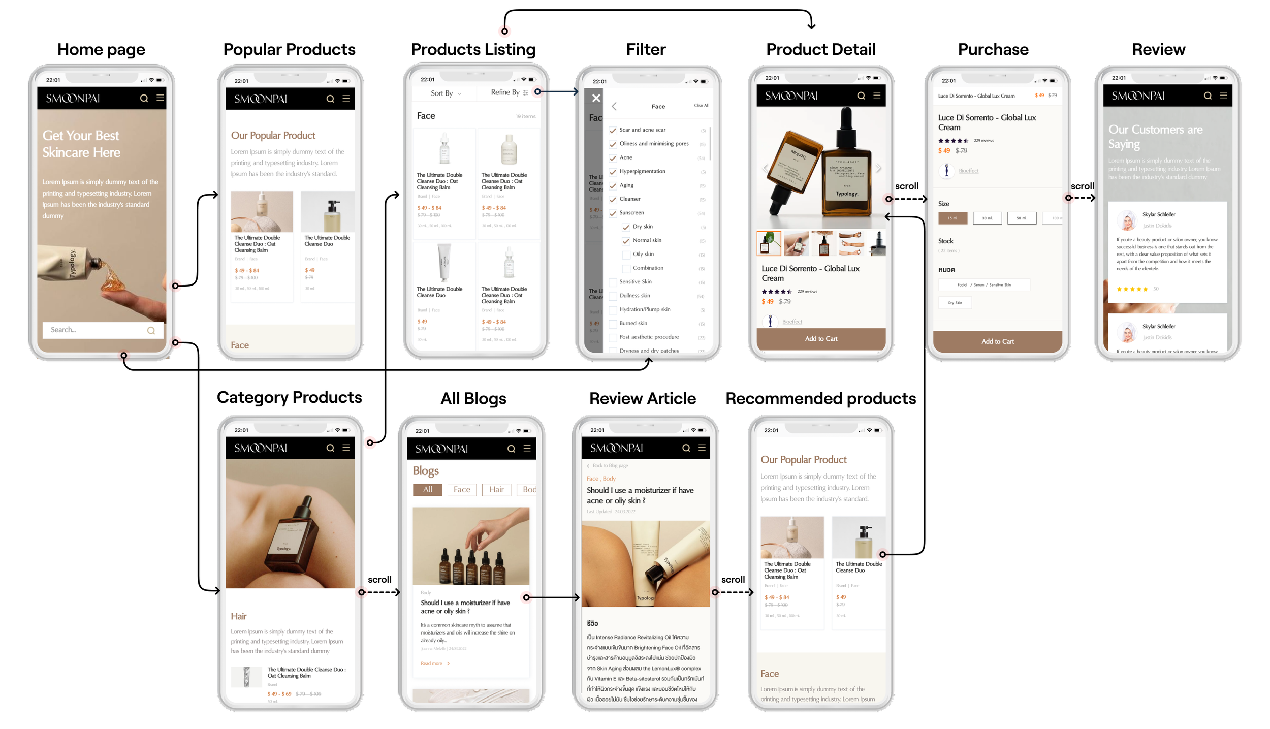
User Flow
The user flow diagram illustrates the interactions beginning on the home page, where users continuously search for skincare products on the Category Products page. In one journey, users select their preferred skincare product from the product listing page, proceed to read detailed information on the product detail page, and ultimately make a purchase. Another journey involves users reading articles and selecting recommended brands. Following this, they choose products on the brand listing page and continue to make a purchase.
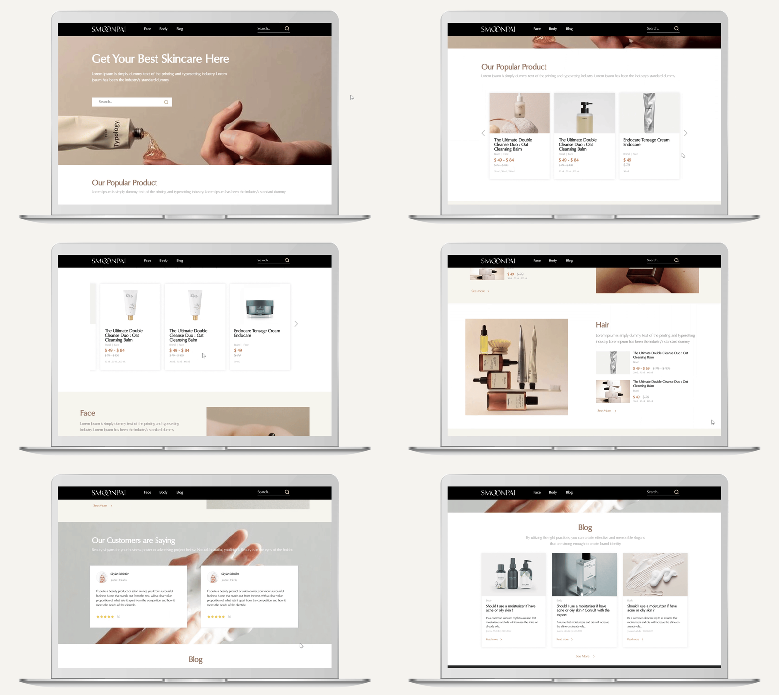
Home page
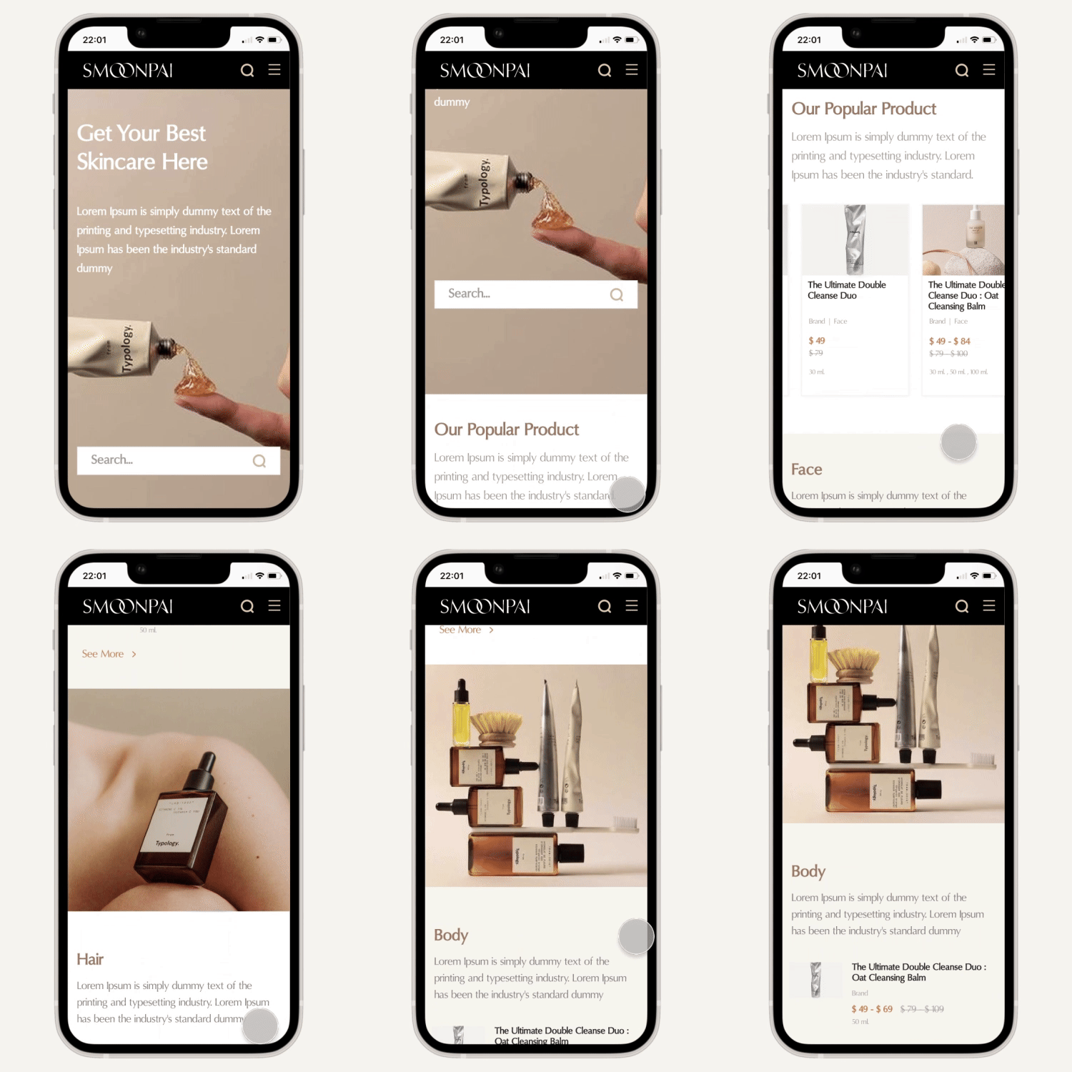
Introduce Smoonpai skincare products and highlight popular items.
Offer recommendations for skincare routines.
Distribute journeys to other pages from the homepage
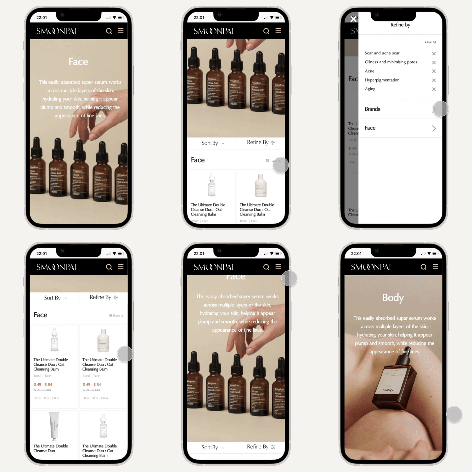
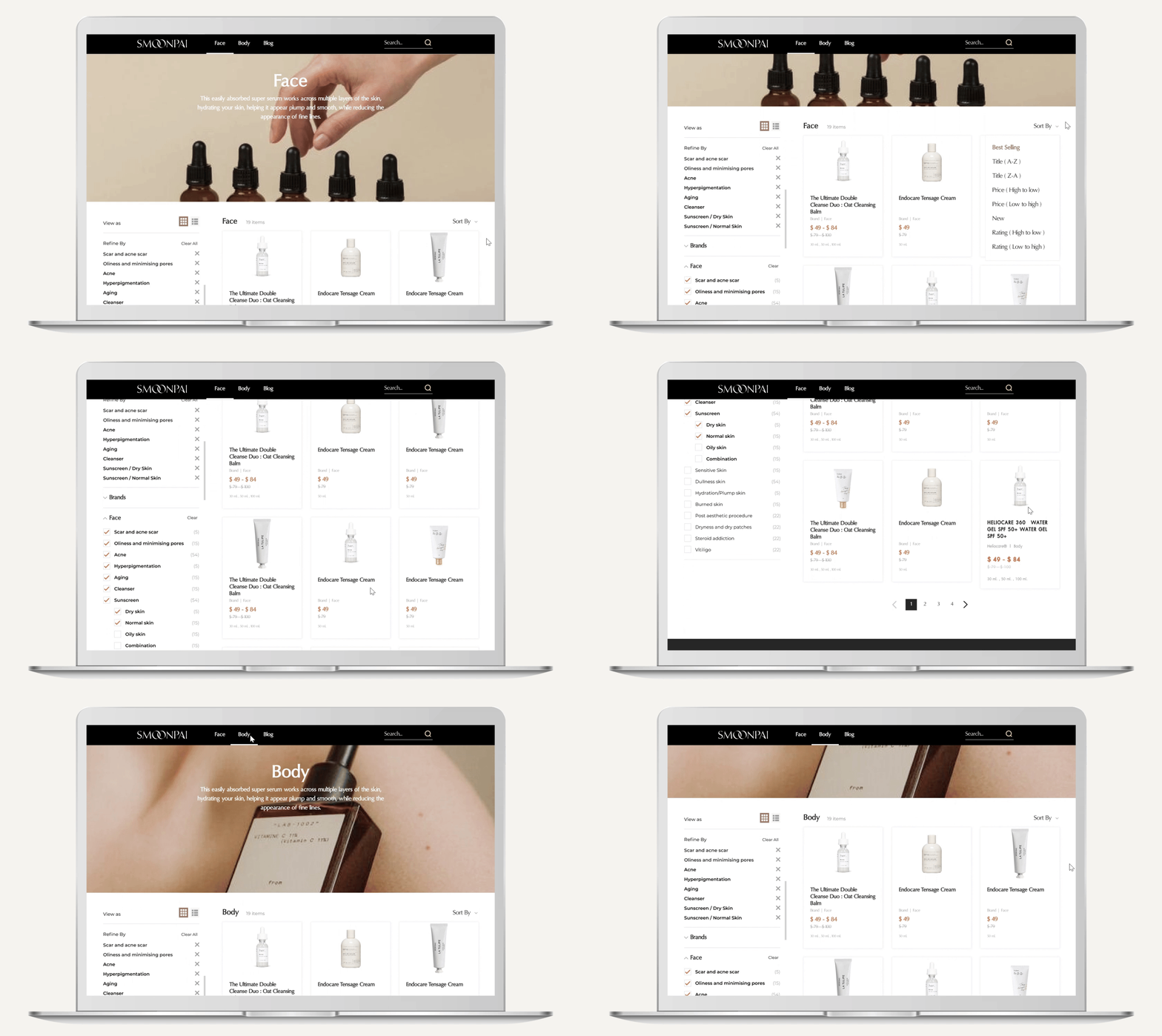
Search by categories
Face and body skincare products.
Offers filters based on skin types: dry, normal, oily, and combination.
Additional filters for specific skin issues: steroid addiction, dryness, dry patches, burned skin, and hydration/plump skin.
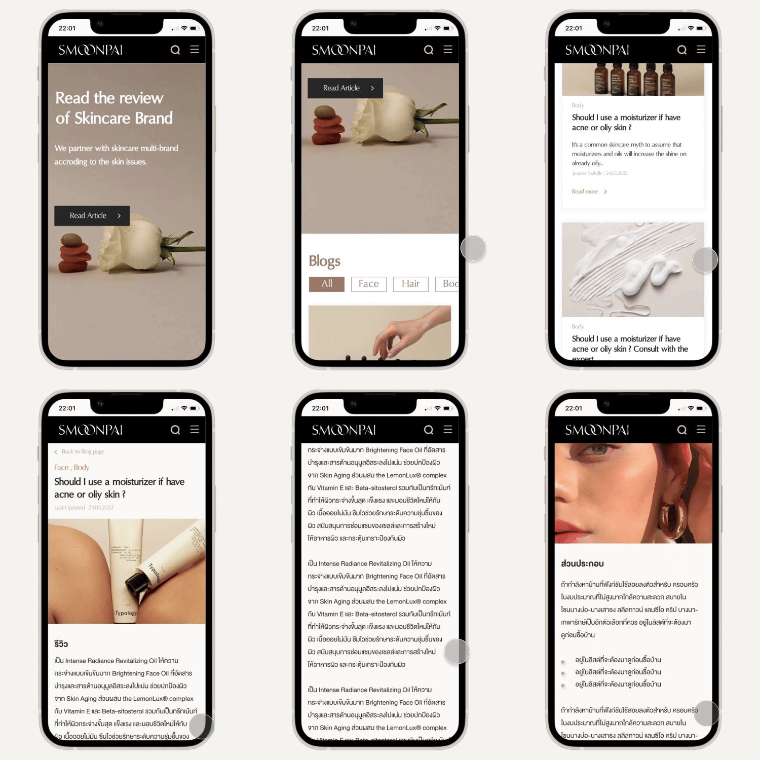
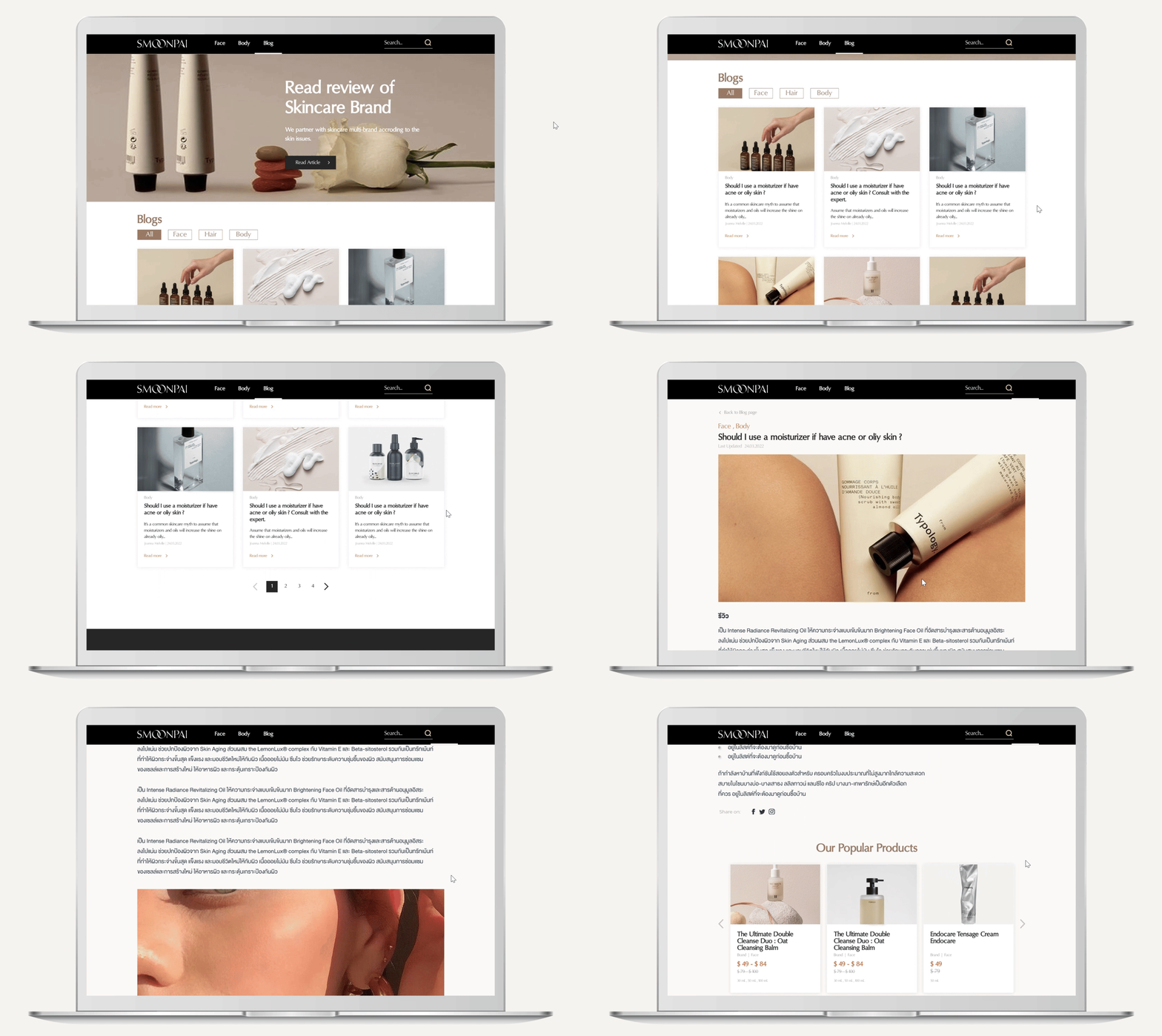
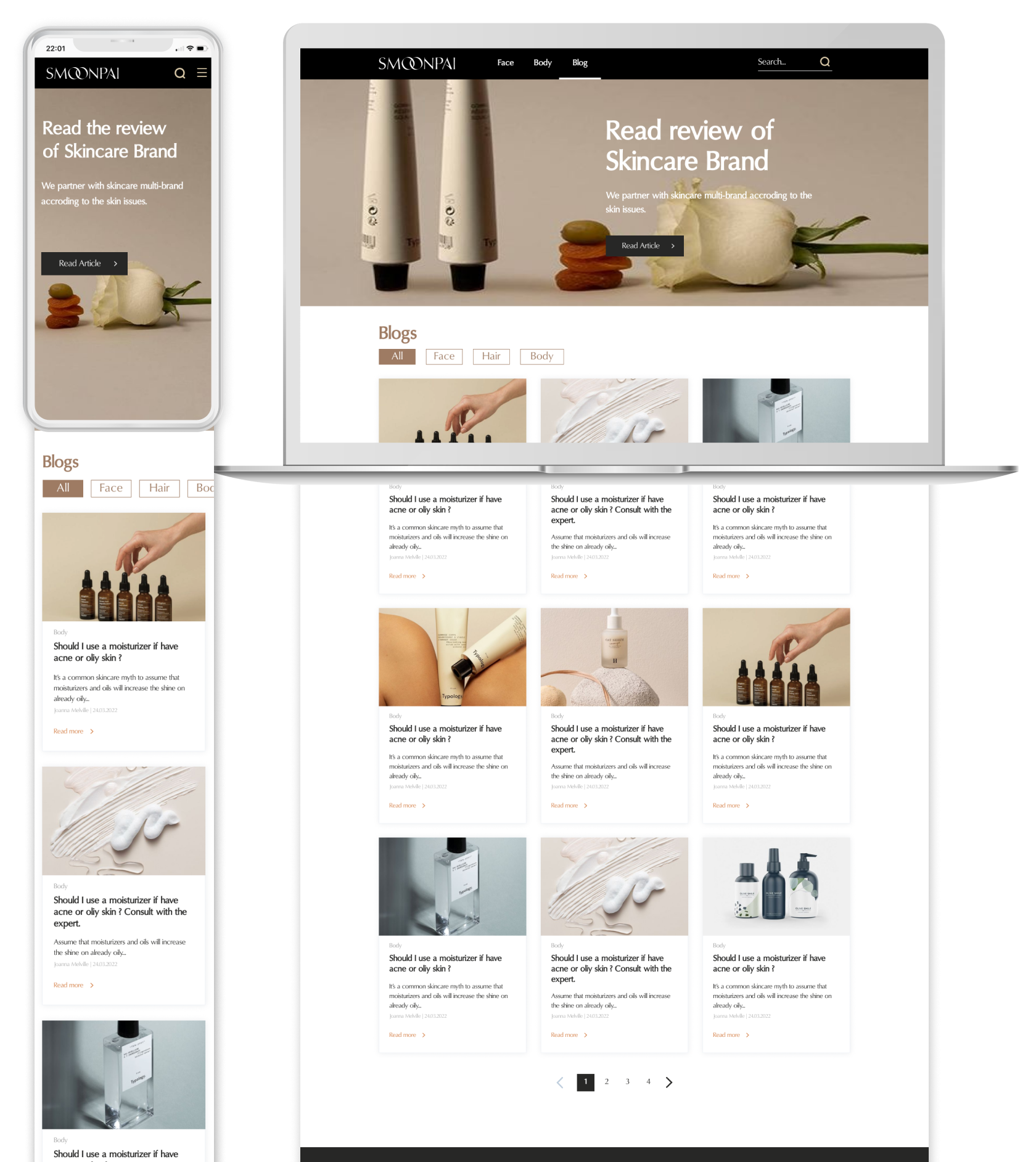
Review articles
Review Articles Page for skincare products.
Features customer reviews and feedback for each product.
Allows exploration of real user experiences and opinions.
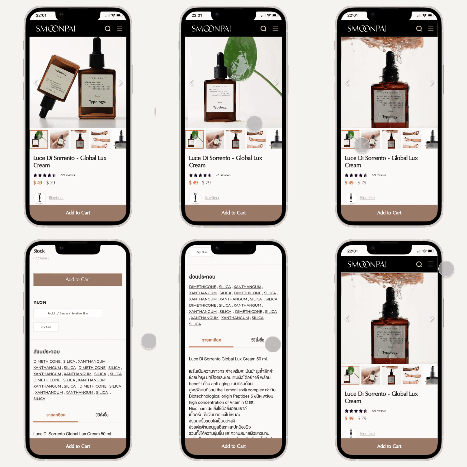
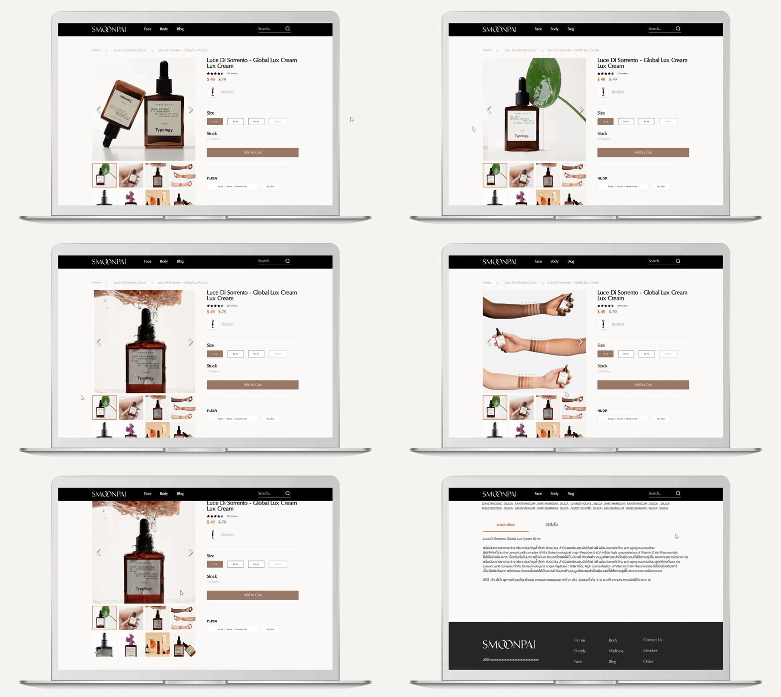
Product Detail
Displays detailed images of each skincare product.
Includes comprehensive information on ingredients.
Provides cautionary advice and usage guidelines.
Final Design
Landing page
Search by skin types
Blog and review
Product Detail
